Play&Go: Tidy rooms, responsible kids
product design

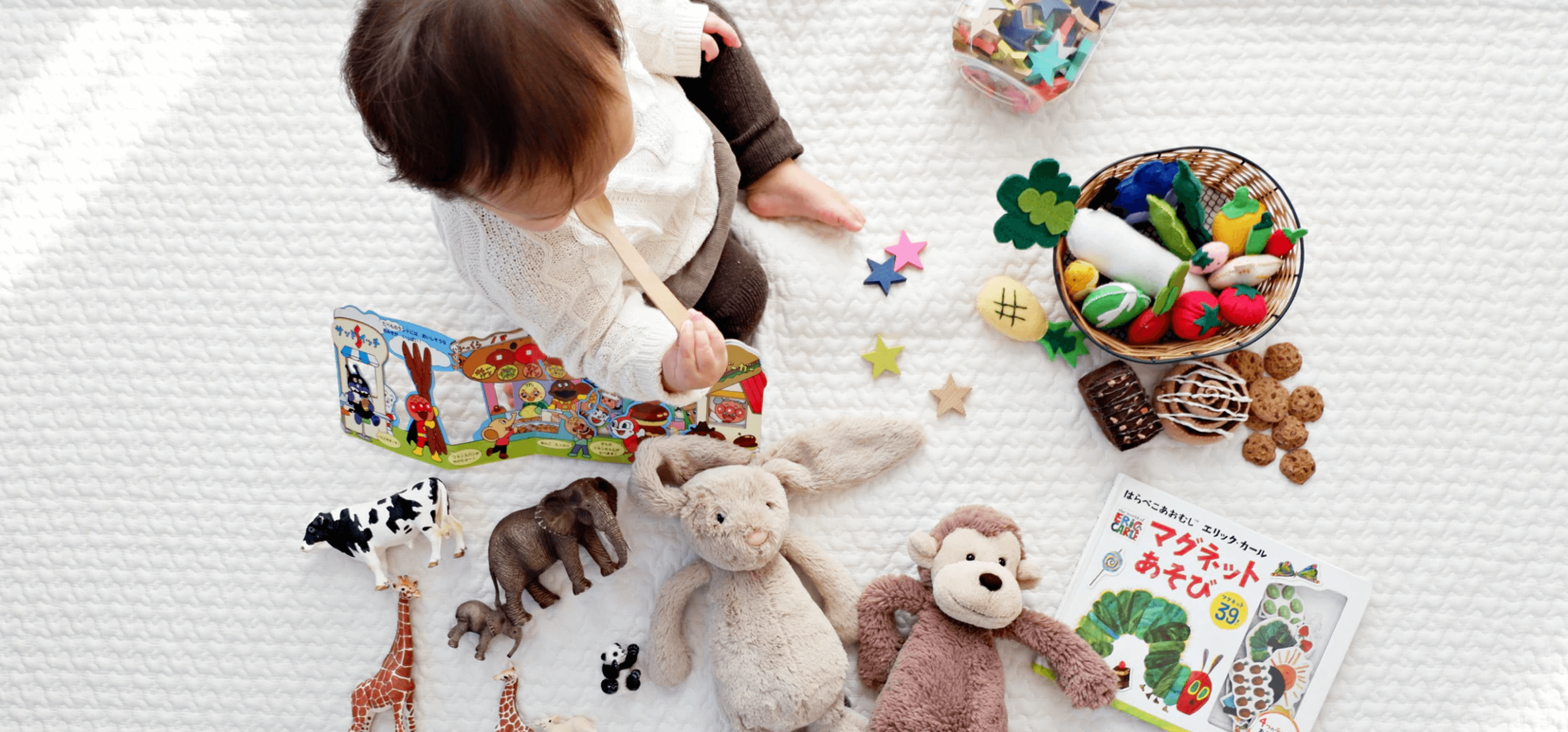
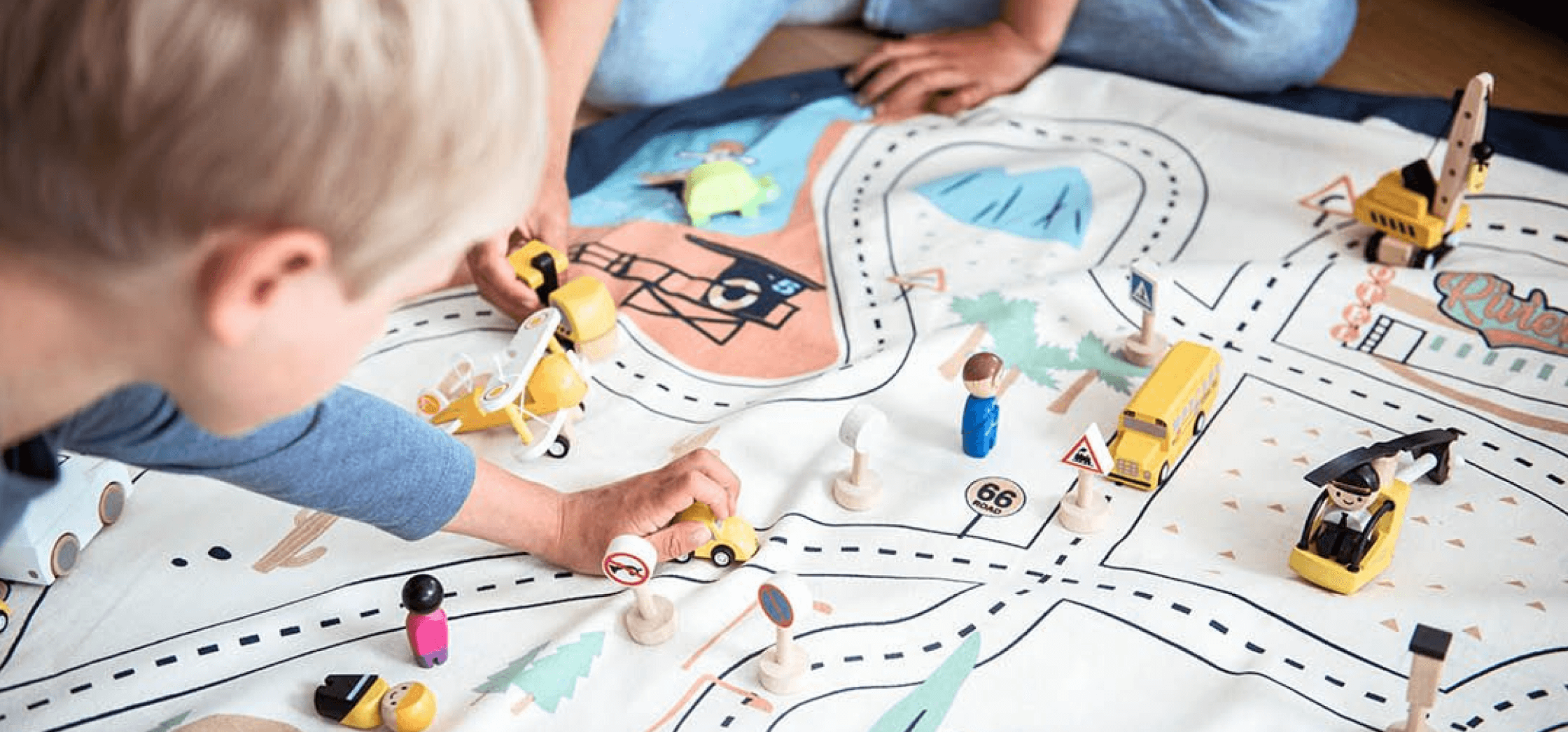
Play&Go’s mission is to provide a simple and effective solution for storing toys. Playful themes and vivid patterns of the bags motivate kids to clear away their toys with one swing. It’s a smart and fun way to deal with the toys laying around the house. Its portable and durable design makes it the perfect toy storage sack for the beach, park, the holidays, or any trip.
Scope of work
Strategy
UX Design
UI Design
Challenges the website was facing
The main challenge was to improve the overall functionality of the website. The user experience, the ordering process, and keeping the customers informed were the major issues that had to be fixed as soon as possible. Considering that the website works on both B2C and B2B levels, our results had to match the target audience in a way that would reduce shopping cart abandonment.
Smooth flow of
the design process

Reducing
bounce rate
To achieve a carefree user flow, all the elements are placed logically and accordingly.

Improving the site’s trustworthiness
The implementation of new features and setting them in context builds trust for users.

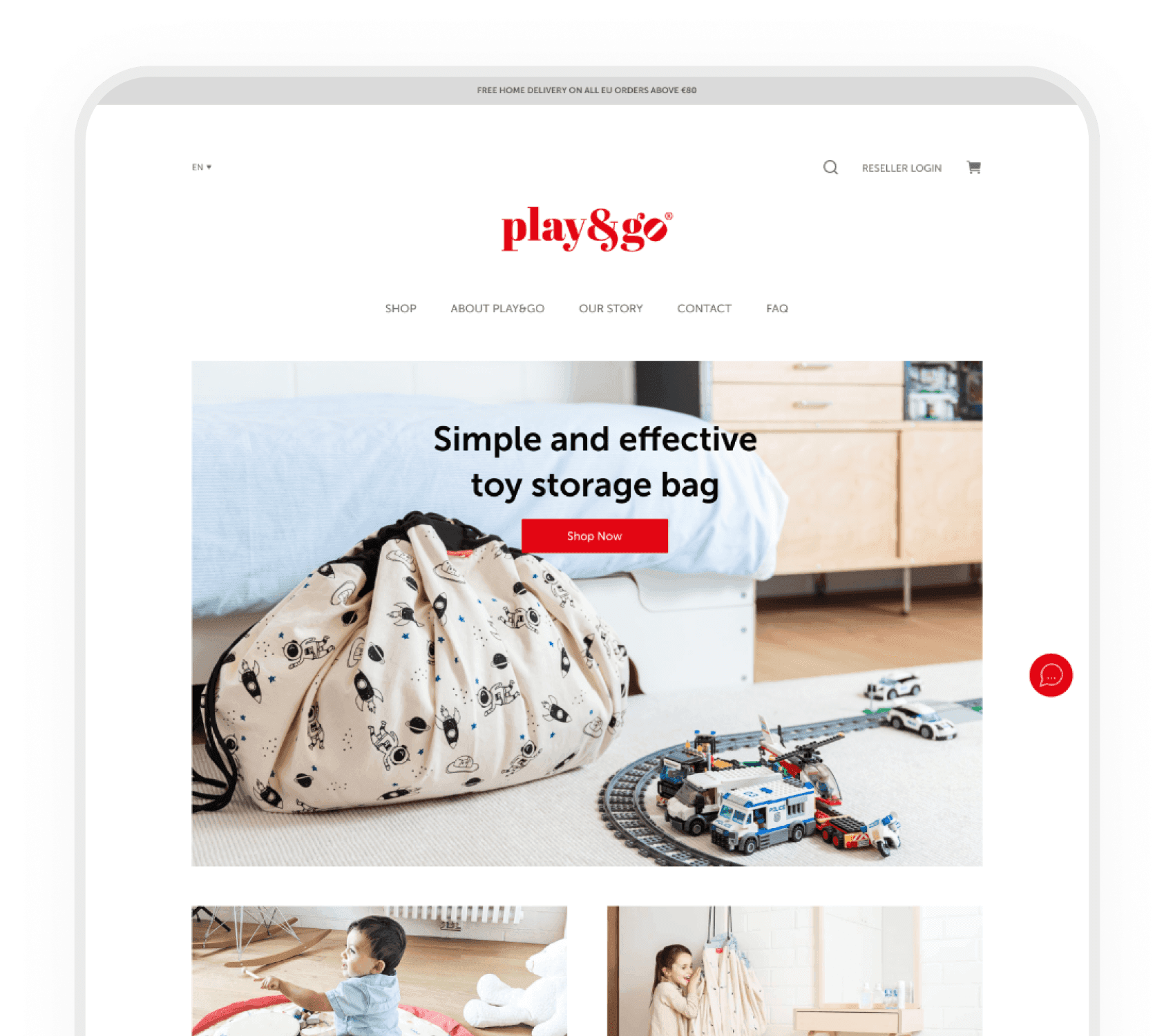
A website that’s modern and clean
While keeping usability in mind, we’ve incorporated up-to-the-minute UI trends.

Attention to mobile responsiveness
Accommodating for smaller screens means users can purchase products on the go.
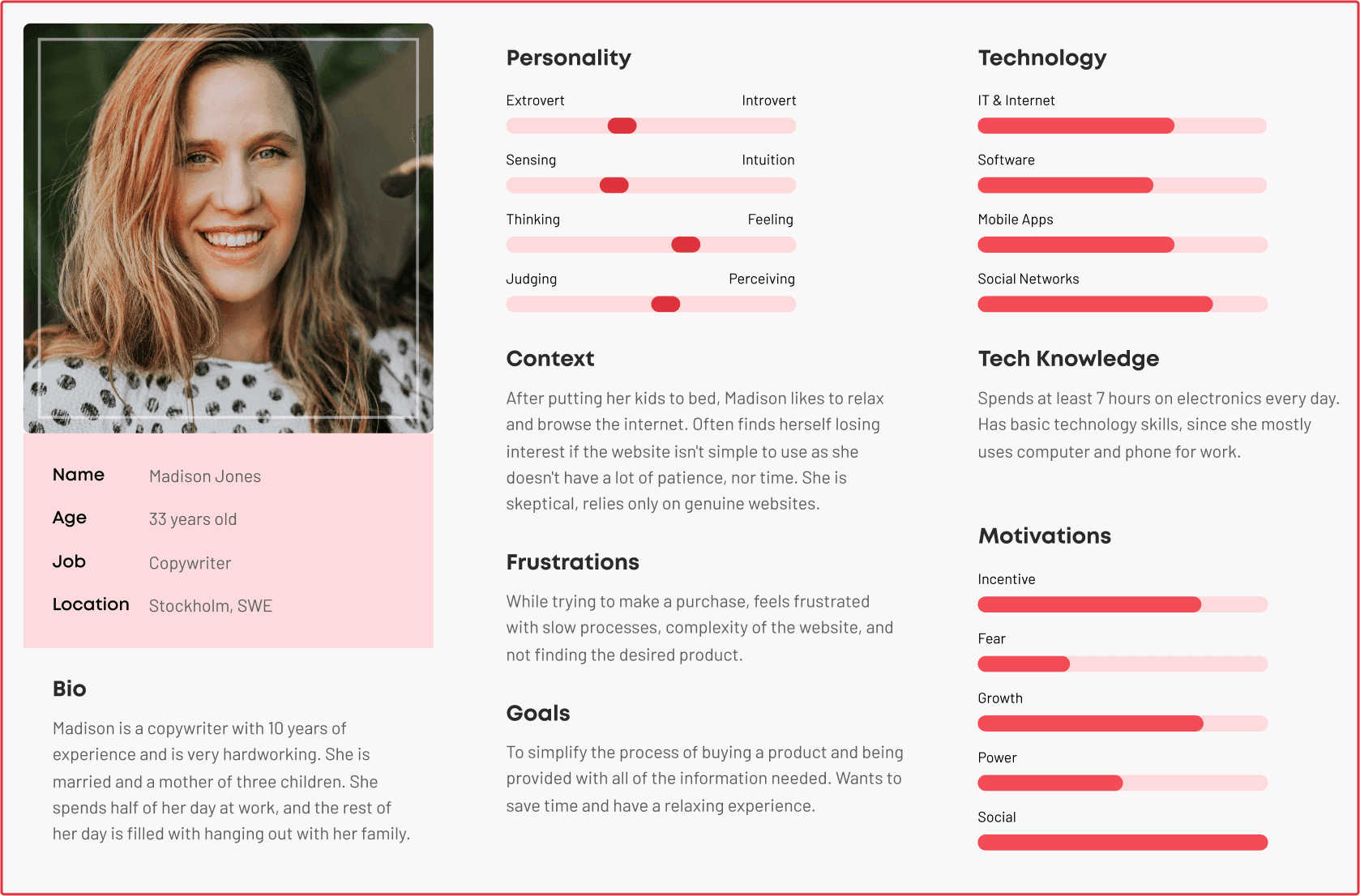
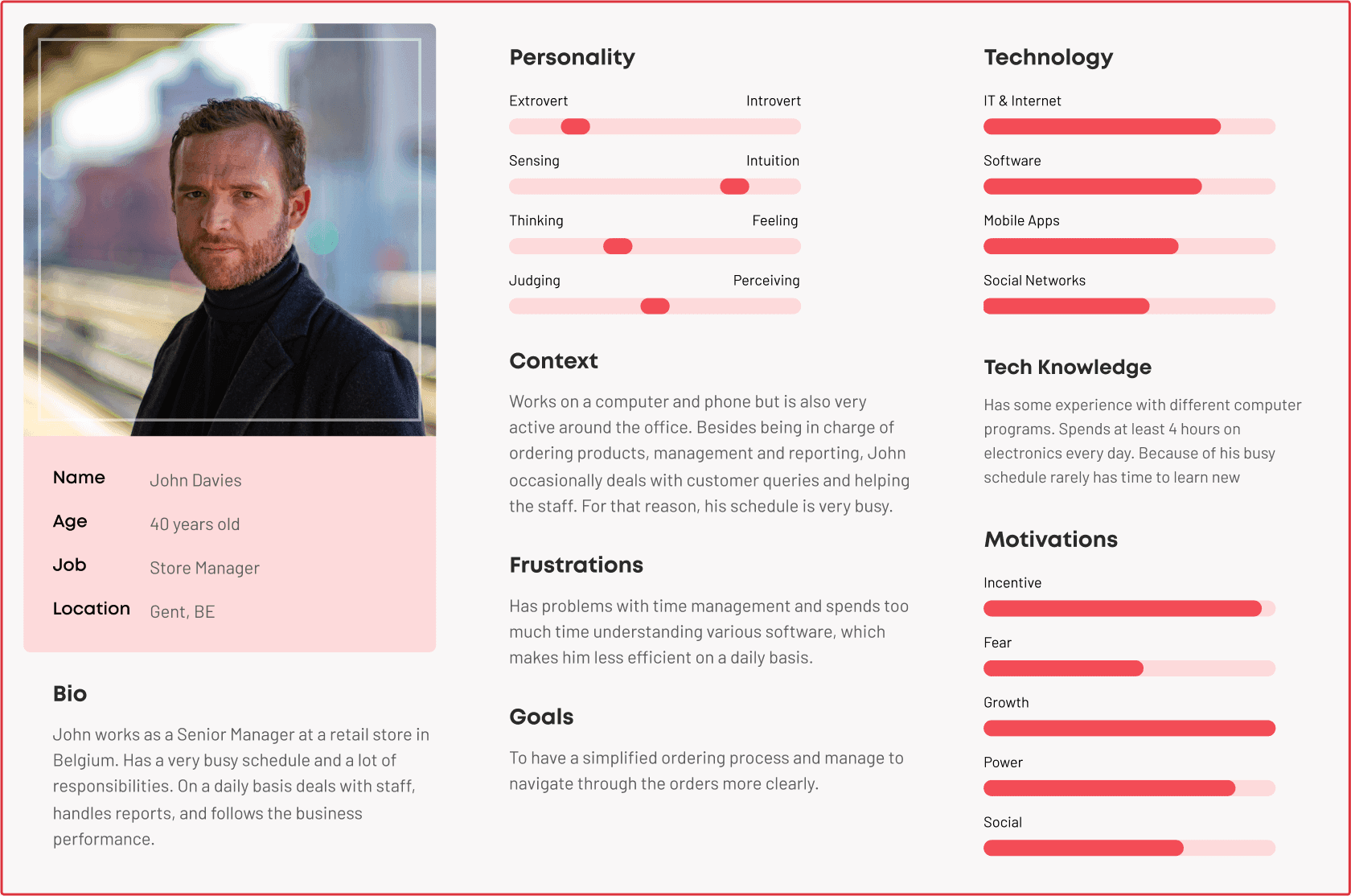
Representing different customer types
Research is the initial stage of every project. It’s all about understanding how we can help the client to level up their product and increase their sales. Due to the nature of Play&Go’s website, the first phase of research was defining user personas to get a clearer picture of its audience.
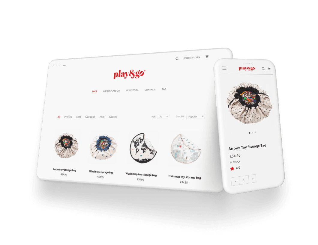
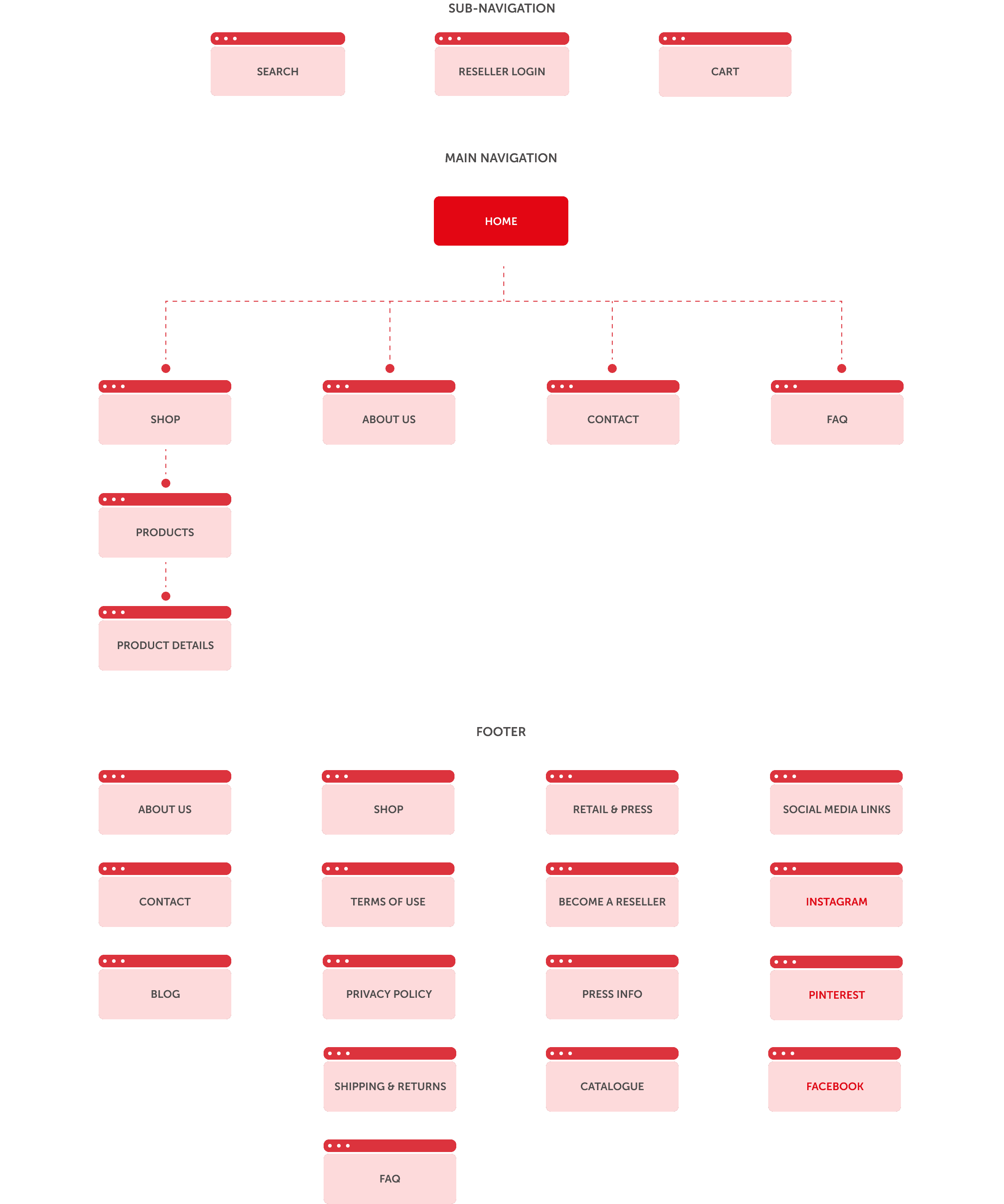
Redefining the already existing sitemap
Once we specified the personas, the next step was redefining the already existing sitemap. The slight changes we incorporated were adding the Search icon and content spacing. Our designer defined the hierarchy of the user's attention, elaborated on it, and placed things accordingly so every age group can easily understand it.
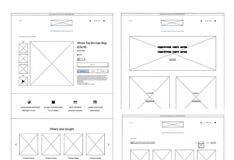
An easy way of
purchasing
the product
The low fidelity phase was where we defined key changes. The goal of those changes was to enhance the entire user experience and to increase the conversion rate by adding these sections. Based on these wireframes, we managed to scale this flow and set up its architecture.
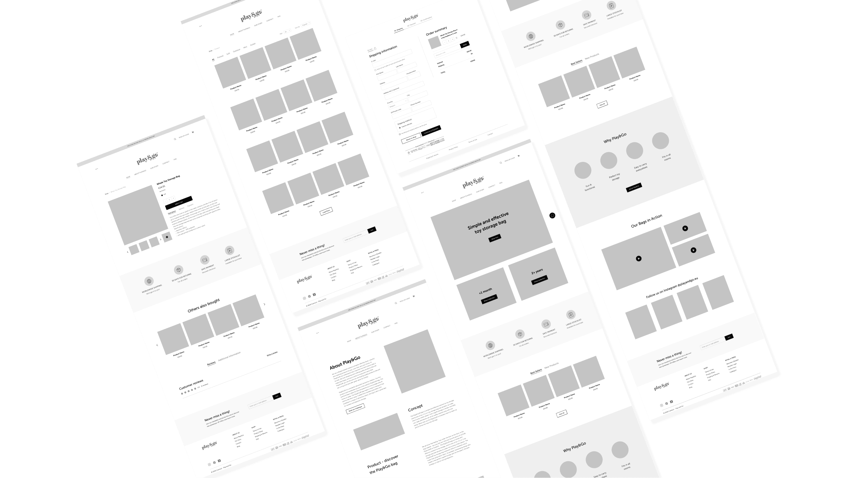
Maintaining a flow structure
High fidelity means bringing low fidelity to life. We positioned the existing wireframes onto the grid and defined each section, so we could implement the same structure specified in the previous phase.
Enhancing the
engagement with inviting
design
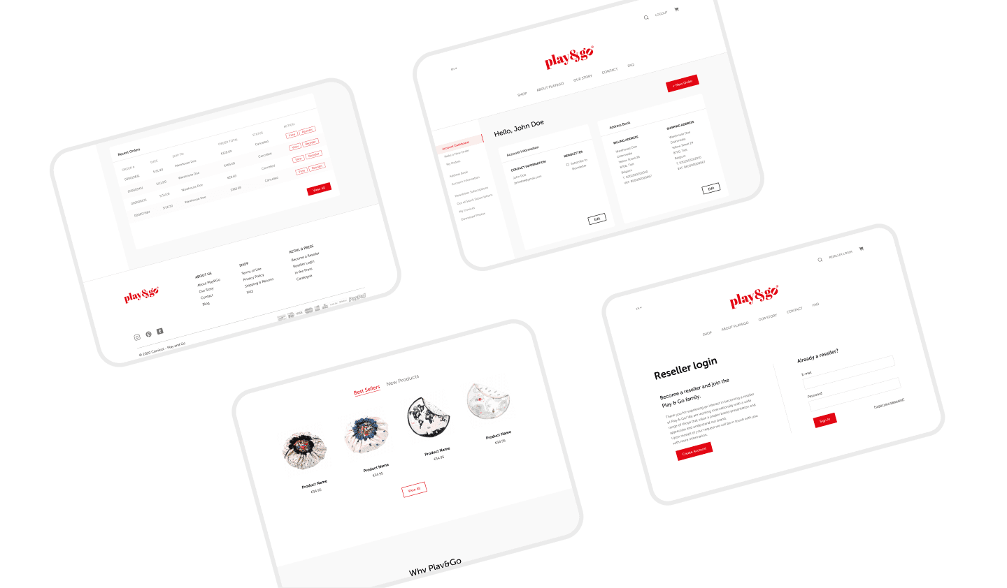
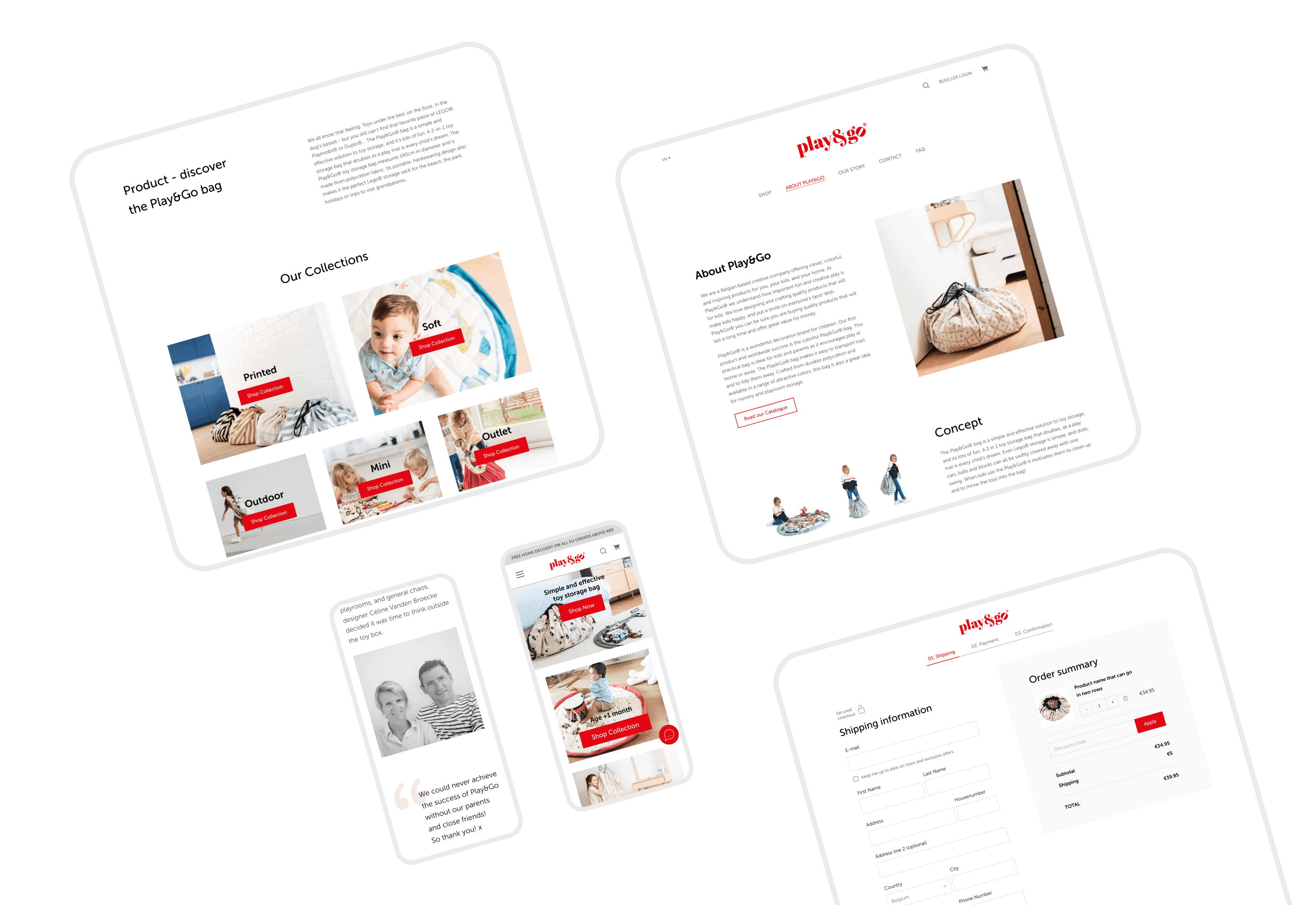
An interface adjusted for both B2B and B2C customers
Our designers ironed out the issues by adding new features and enhancing existing ones for both parties. The result was a simplified customer flow with clear steps which make the ordering process easy – omitting confusion and crowded screens. We created two streams: one for businesses, which are given a profile and a dashboard to manage their purchases, and on the other side, one for customers who order directly from the website. Cinnamon crafted a simple and clean design with an impeccable user flow, for both kinds of users.
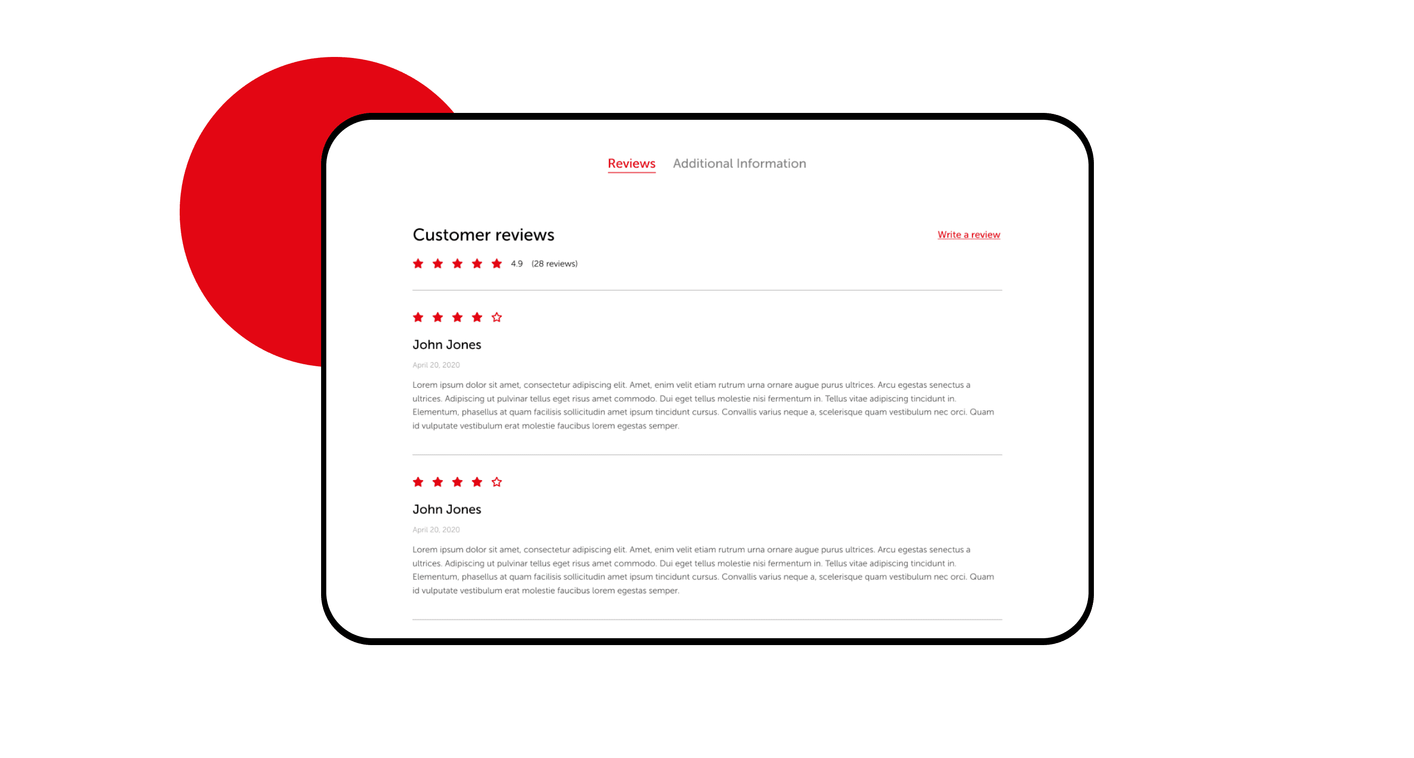
Customer reviews to increase trust
The purpose of this section on the product page is to gain trust from the products and the website itself through reviews. Actual customers leave real comments and reviews about the product, so other buyers can get first-hand feedback.
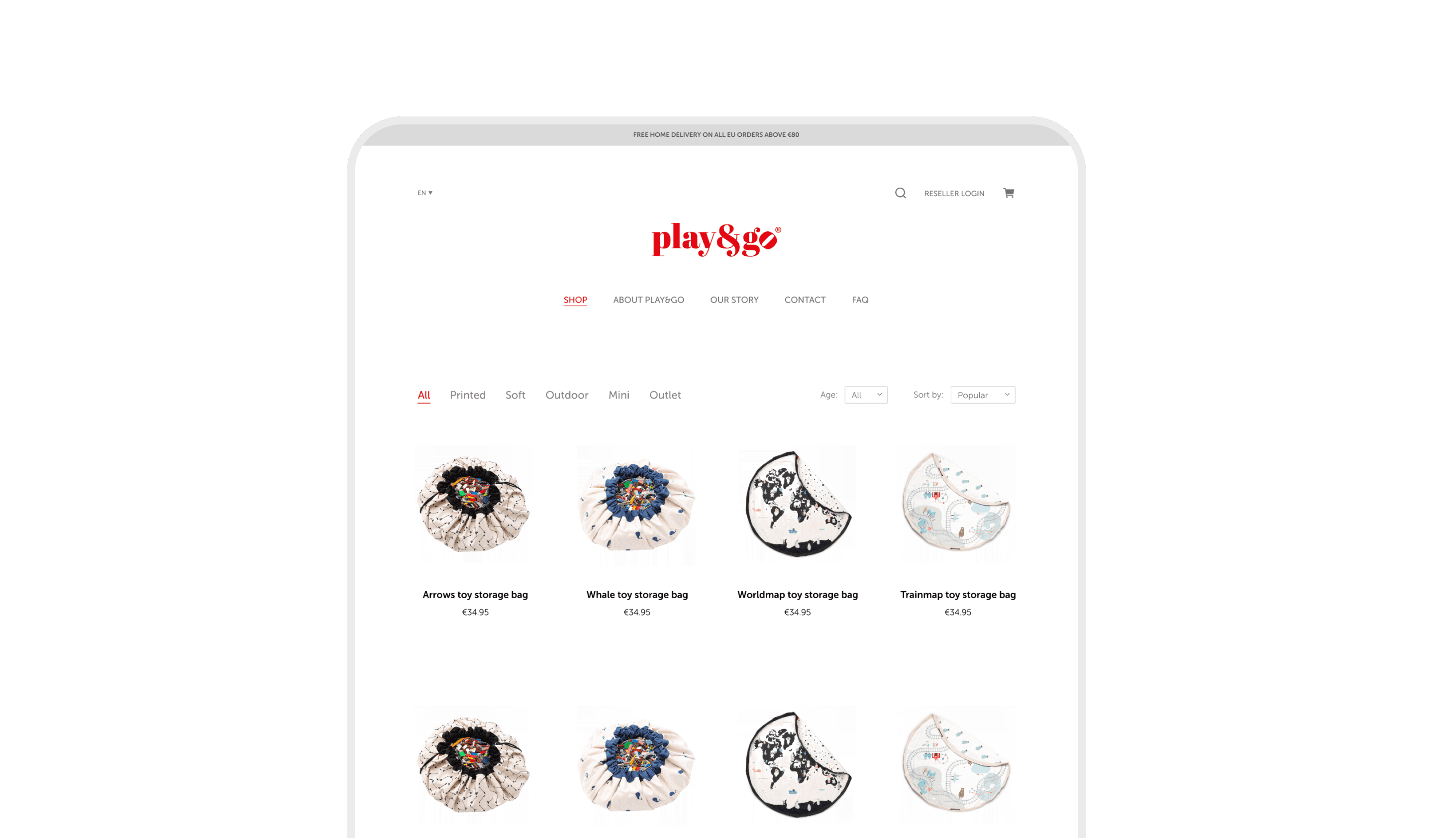
Explore various
categories in the shop
Product categories are instantly visible when users land on the shop page, making categorization more intuitive. This approach potentiates the users to pinpoint the products they intend to purchase.
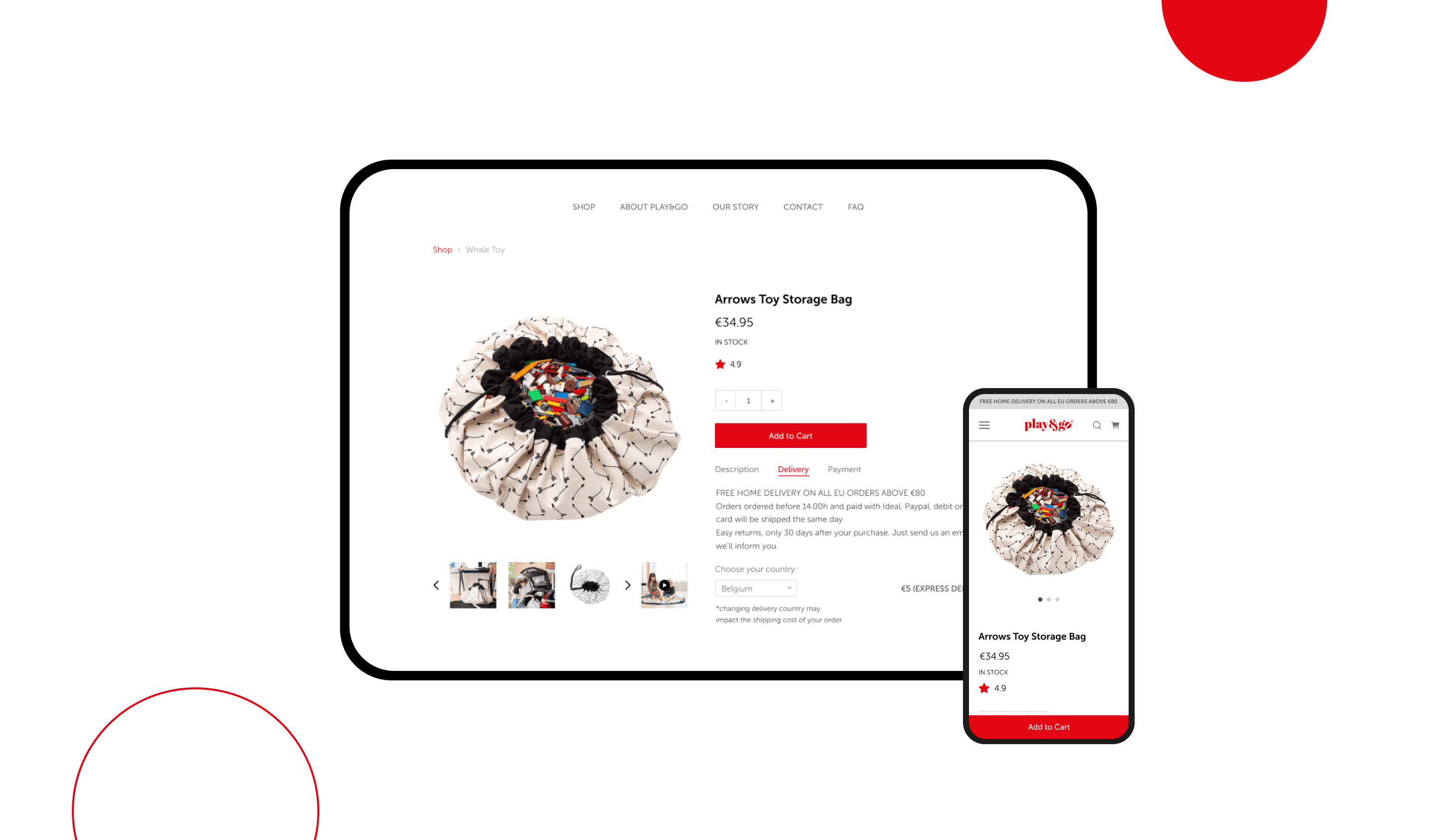
Shipping calculator straight from the product page
Users’ interest in shipping costs already starts at the product details page. The majority of users want to know their total order cost upfront, before filling out forms to initiate the checkout. This notion significantly helped our designers to create a flow that prevents buyers from leaving the website later during the process. Play&Go calculates the shipping directly in the cart along with showing the product’s price.
Clear key selling points
What makes Play&Go stand out? Apart from its enhanced features, benefits, and flawless user experience, Cinnamon brought Play&Go’s values closer to its customers. With well-thought-out solutions and an attractive design, we managed to convert users who browse into customers who buy.
Styleguide
Their team’s design skills definitely set them apart.
They do excellent work in all areas of the project, but it is specifically their design work that puts them head and shoulders above the rest.

Alain Puysteins,
CEO, Play&Go
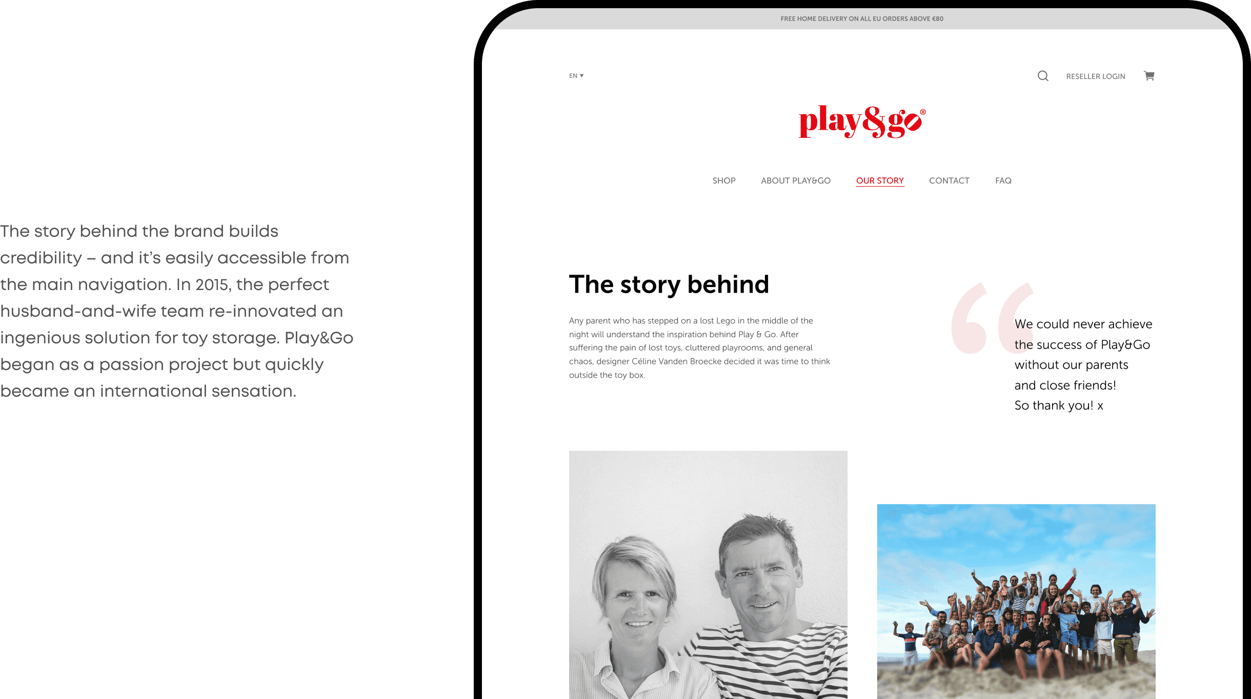
Breakthrough into the international market
In 2015, the entrepreneurial couple re-innovated an ingenious solution for toy storage. Play&Go began as a passion project but quickly became an international sensation. When their one-of-a-kind storage bag debuted on Japanese and French national television, they knew their passion project was destined to become something bigger than they could have ever imagined!
This project taught Cinnamon one more lesson in increasing conversion rate while reducing bounce rate. We had to keep in mind the marketing analytics, as the project in question was an e-commerce site. What we learned is that this goal can be accomplished by simplifying the user experience with special attention to the check-out process and improving the shopping cart experience.
Now, users can order toy bags from the palm of their hands and Cinnamon has accelerated this online sale potential.

Similar projects
product design
mobile development
quality assurance
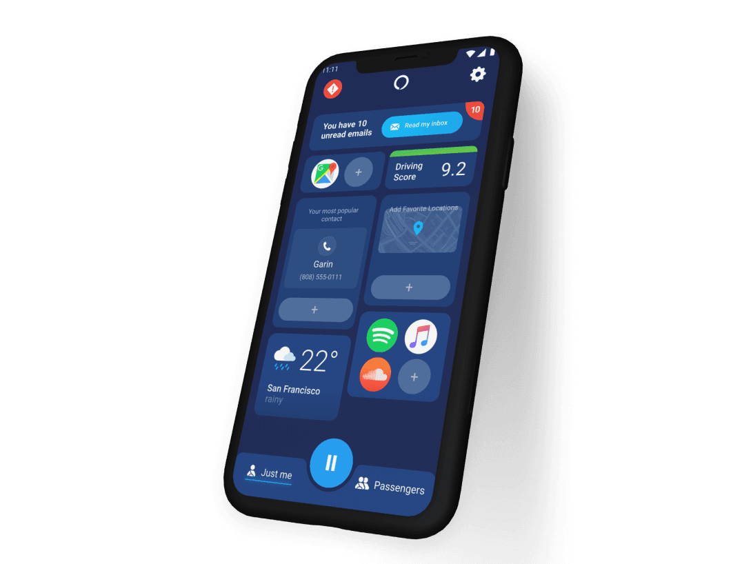
Listen to messages on the move
Among other features, Cinnamon developed the “drive-safe” mode, where users enjoy an eyes-free experience while receiving emails, texts, and messages from various platforms.