Fiona: Engage &
Decide
Fiona is a fintech consumer-facing website that enables users to search for financial products, discover them, and receive personalized recommendations.
product design
web development

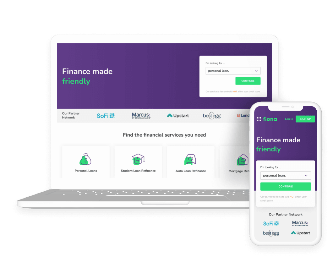
Fiona achieves a delicate balance between user satisfaction and company demands. The primary goal is to meet consumer needs, which begins with a simple but comprehensive data collection process that leads to personalized offers that are easily accessed and filtered for decision-making.
Scope of work
UX Design
UI Design
Frontend Development
What we strive for
in our process

Balanced business and user experience
Meeting user expectations is critical to business success. Our goal was finding balance between client mandatory compliance and user needs.
Tight collaboration with development
Considering its function as well as it is aesthetic, the cooperation between developers and designers is key to finding the best solution.
Engage and help users
We aim for an effortless journey that makes decision-making easier and encourages users to find and select an option.
Attention to mobile responsiveness
The goal was to provide a consistent user experience across platforms, with a focus on smaller displays, as mobile users provide most of the traffic.
Get offers
with ease
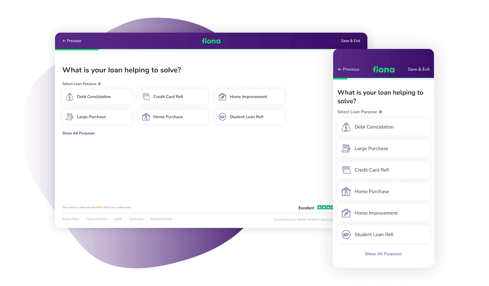
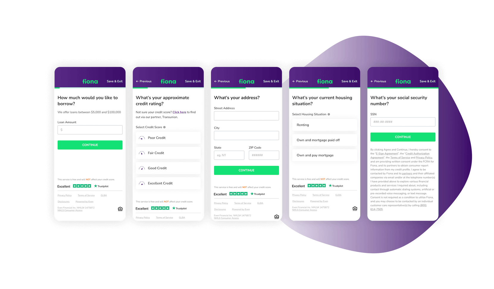
Fiona features a comprehensive loan application process, with the purpose of matching the user's needs to the best matching offers. The application flow is intended to reduce cognitive load and enable users to concentrate on the questions at hand
It’s really that simple
Smooth user experience is emphasized with large input fields and their respective states, while loan purpose icons offer better legibility. Throughout the application flow, the great variety of question types use the same structure, and completion is easily tracked via the progress bar.
Your actions tracked
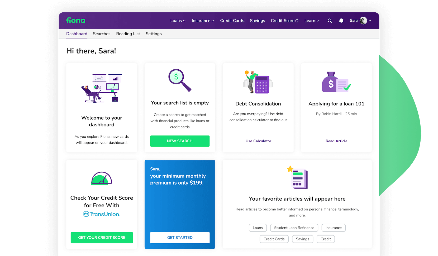
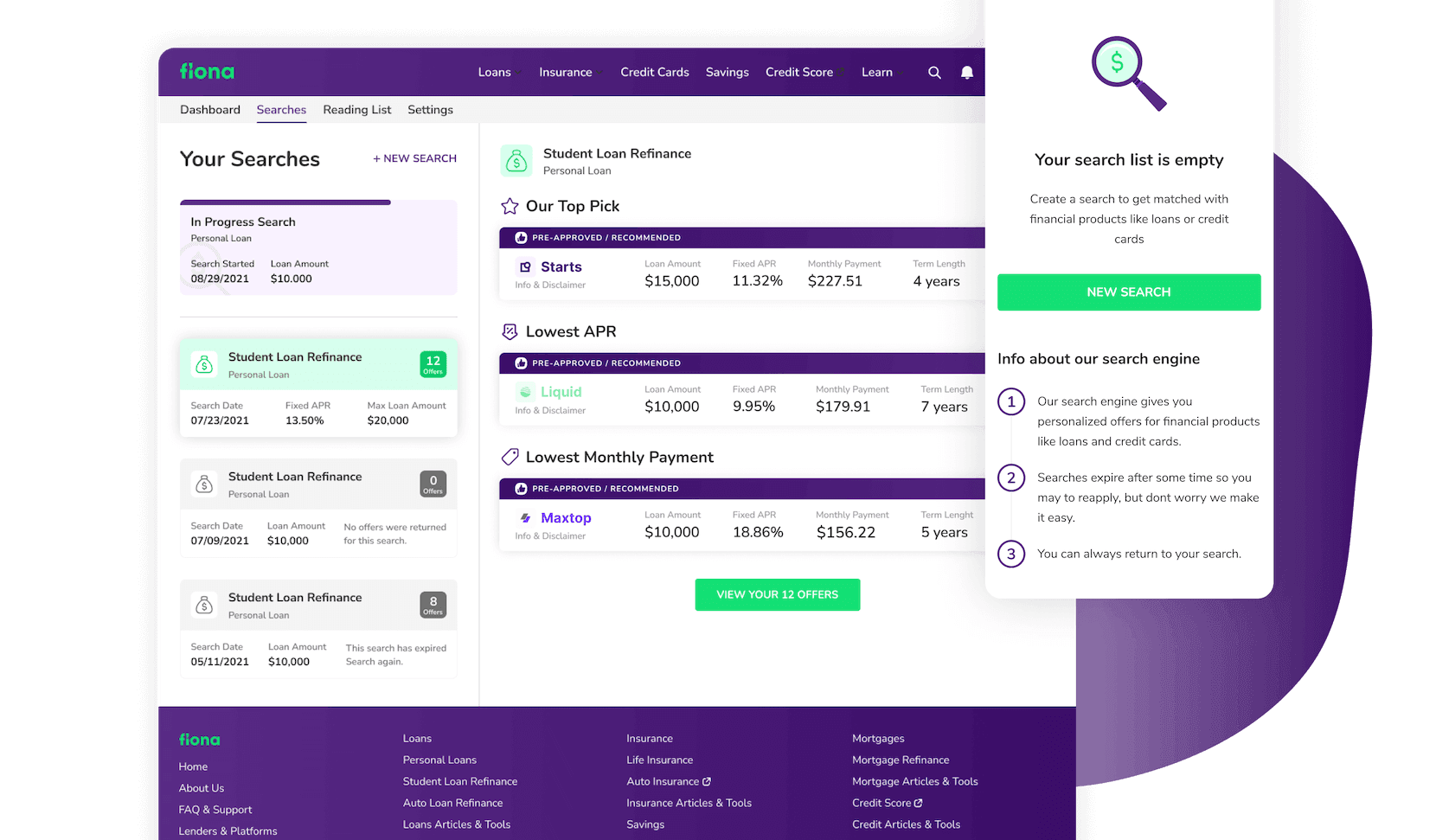
The user's dashboard is a tiled display of Fiona's different functions. Its core purpose is to provide users a place to keep track of recent loan queries and complete those that are still in progress, but for first-time users, the dashboard defaults to colorful empty-state cards that suggest useful actions that can be made.
View your
searches in
detail
To ensure the users have the best possibility to get offered a loan, the Search History comes into effect. A more detailed and complete overview of all past and ongoing searches. Users can easily browse and click through a stack of search summary cards and results view.
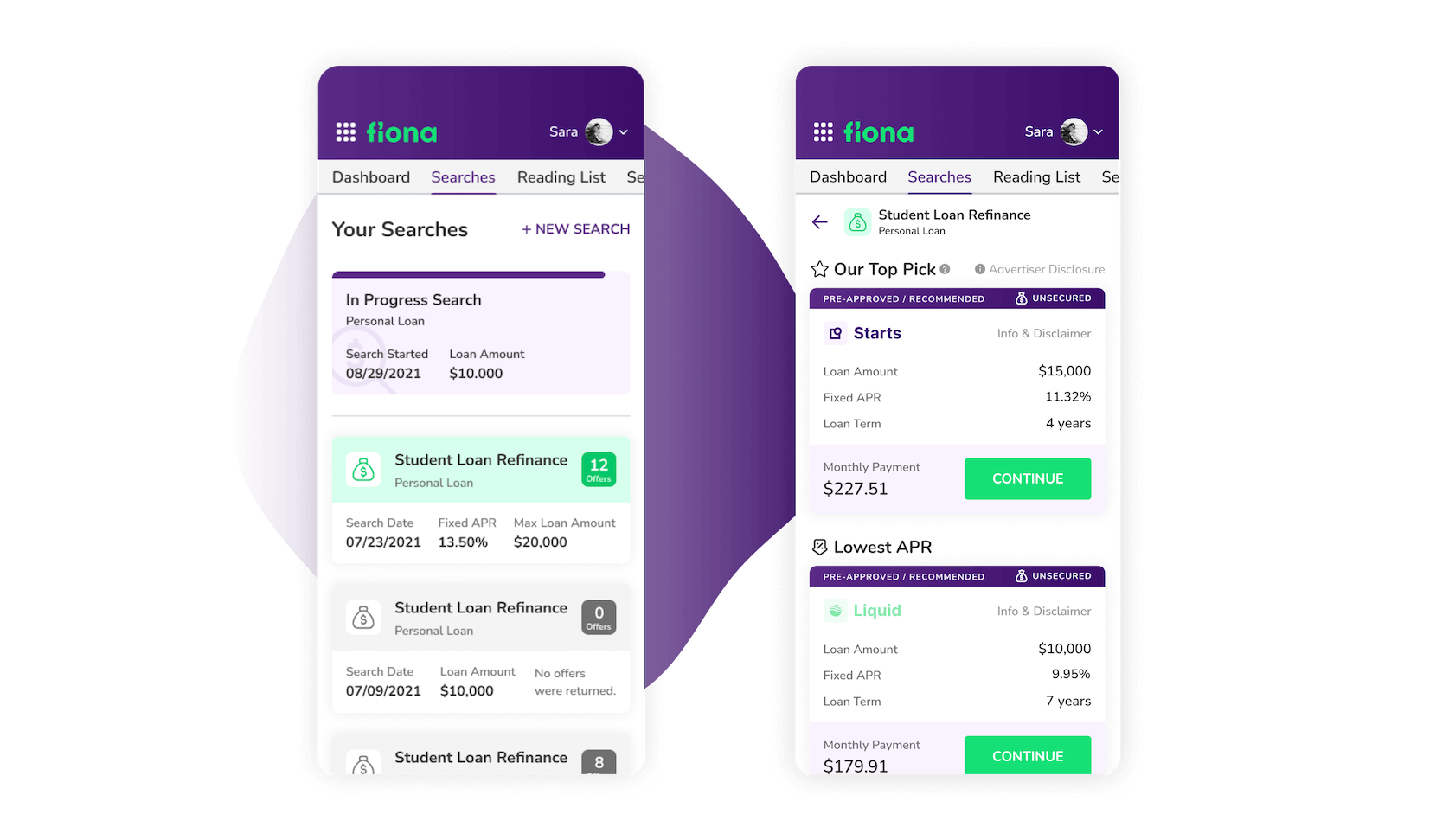
Search history on small screens
Search summary cards, In their various states, contain all of the required information that users may need at a glance. This has been made to fit a smaller screen since the results view is displayed on a different page, making the design legible and readable. It eliminates the visual clutter that can arise while working with this much information.
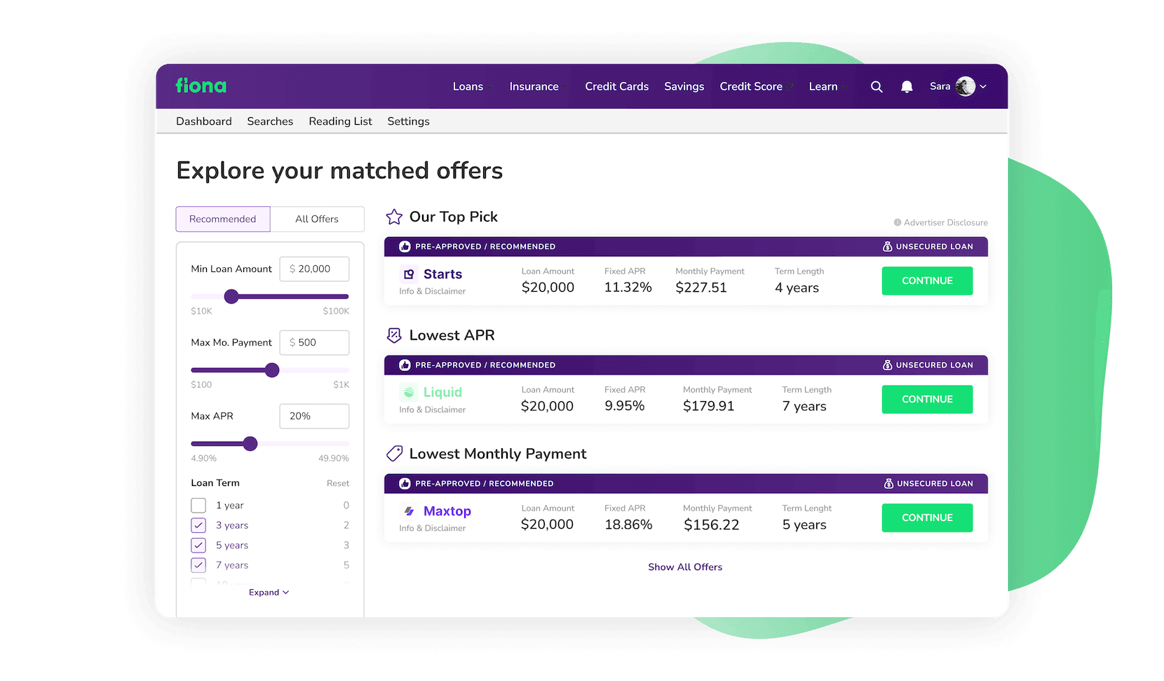
Match with great offers
The results are presented in a way that makes the user’s decision as easy as possible. To avoid overwhelming the user with options, only a few recommended offers are displayed on the first load. But, not to be limited, the user can switch between the offers and utilize a powerful filtering system to identify the one they are looking for.
Striking a
balance
Offers were a design challenge as they had to be small enough to be viewed as a table row while yet being readable enough to avoid causing too much friction. That was ensured by using just enough white space, bright colors, and ideal text sizes.
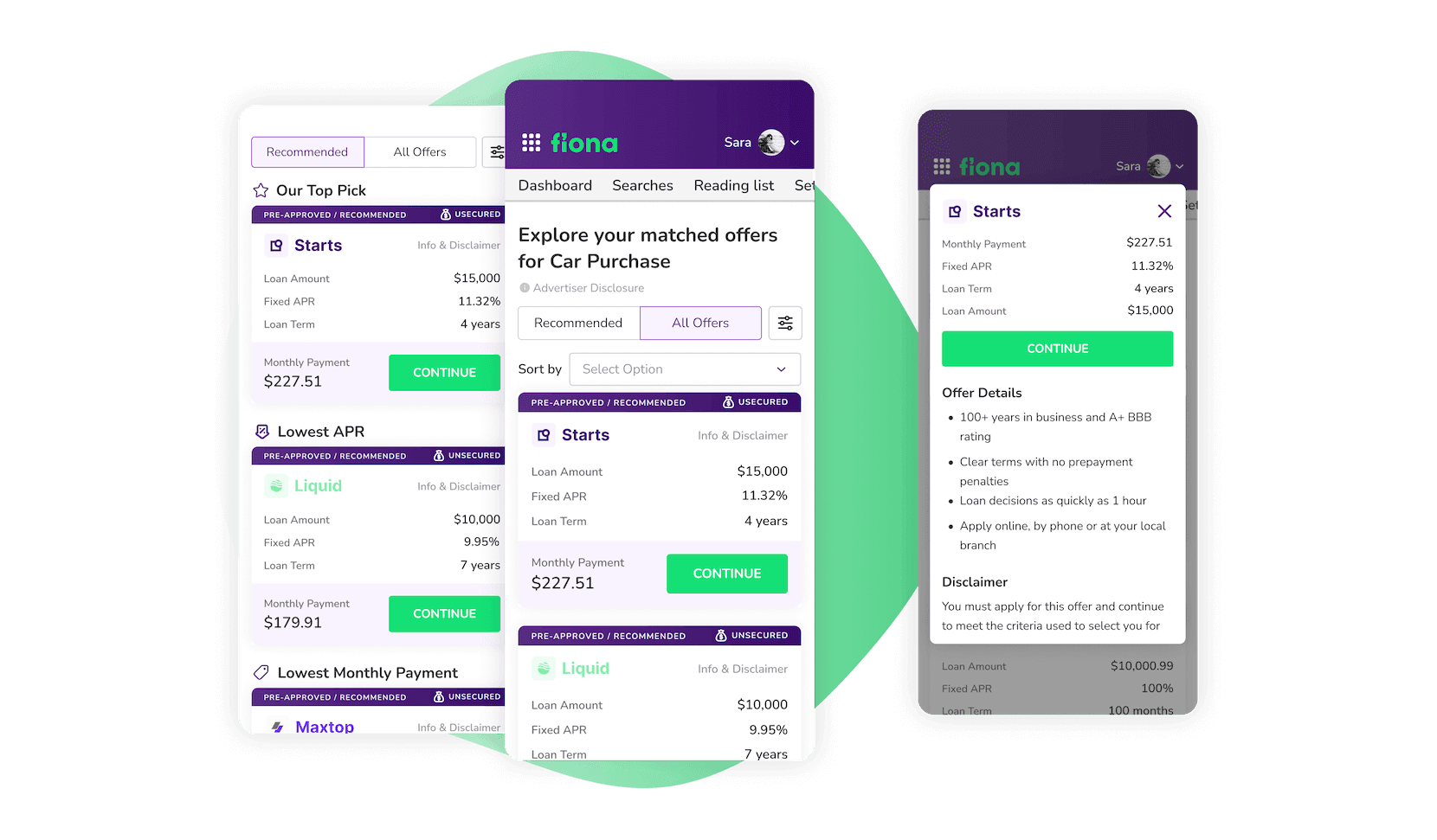
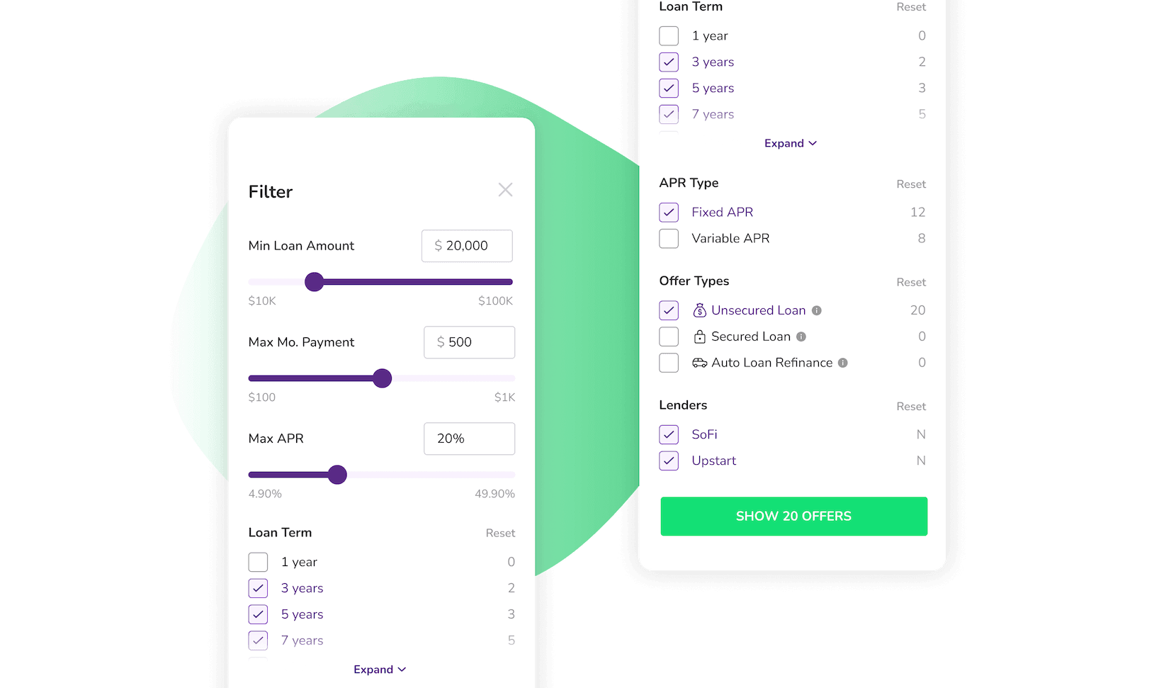
Effortless design
A robust filtering system has been implemented to aid in the decision-making process, but in order for users to use it, it must look simple. We chose sliders and checkboxes over text fields for value input since they require less strain, especially on smaller screens. However, giving the option to type-in values if preferred.
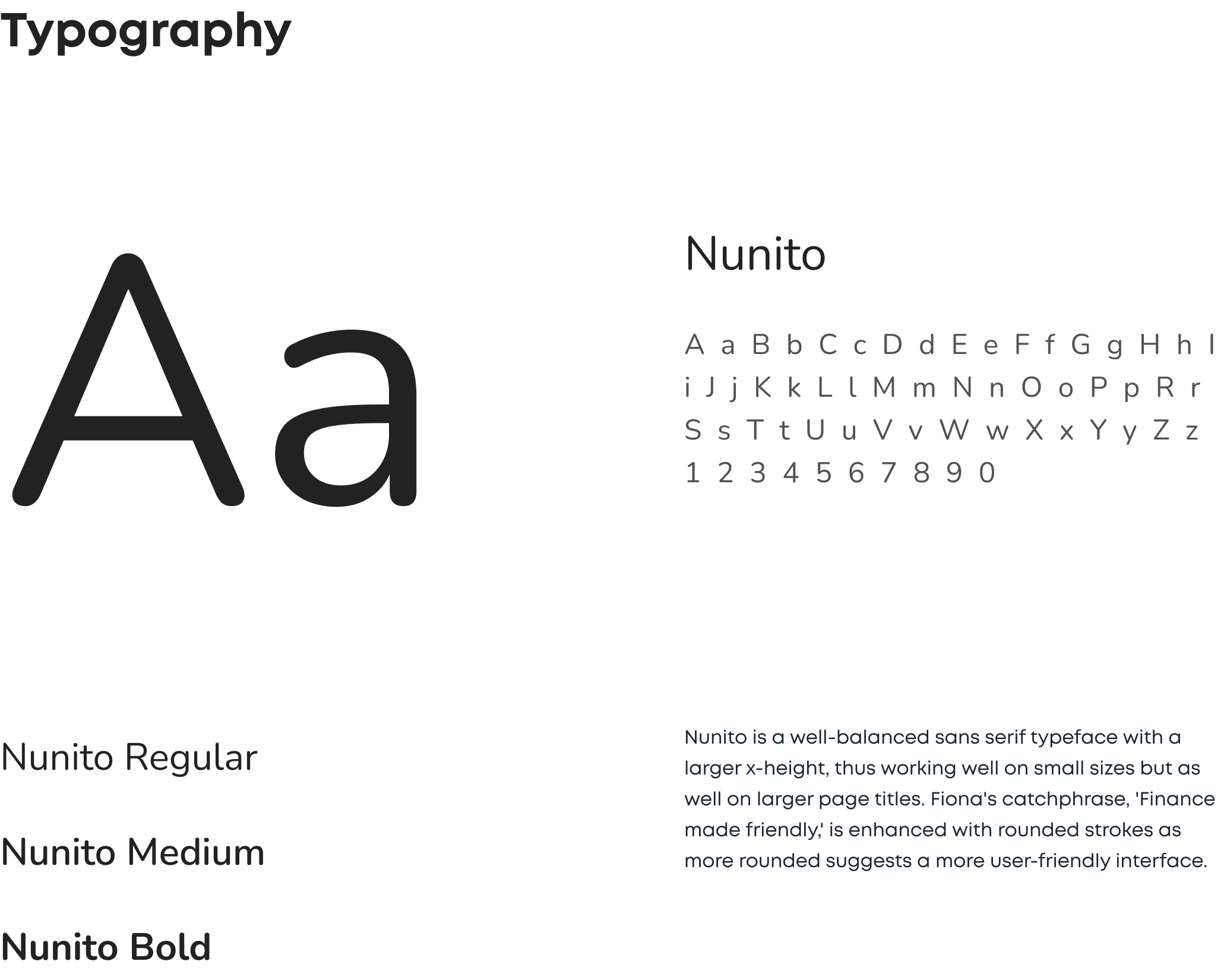
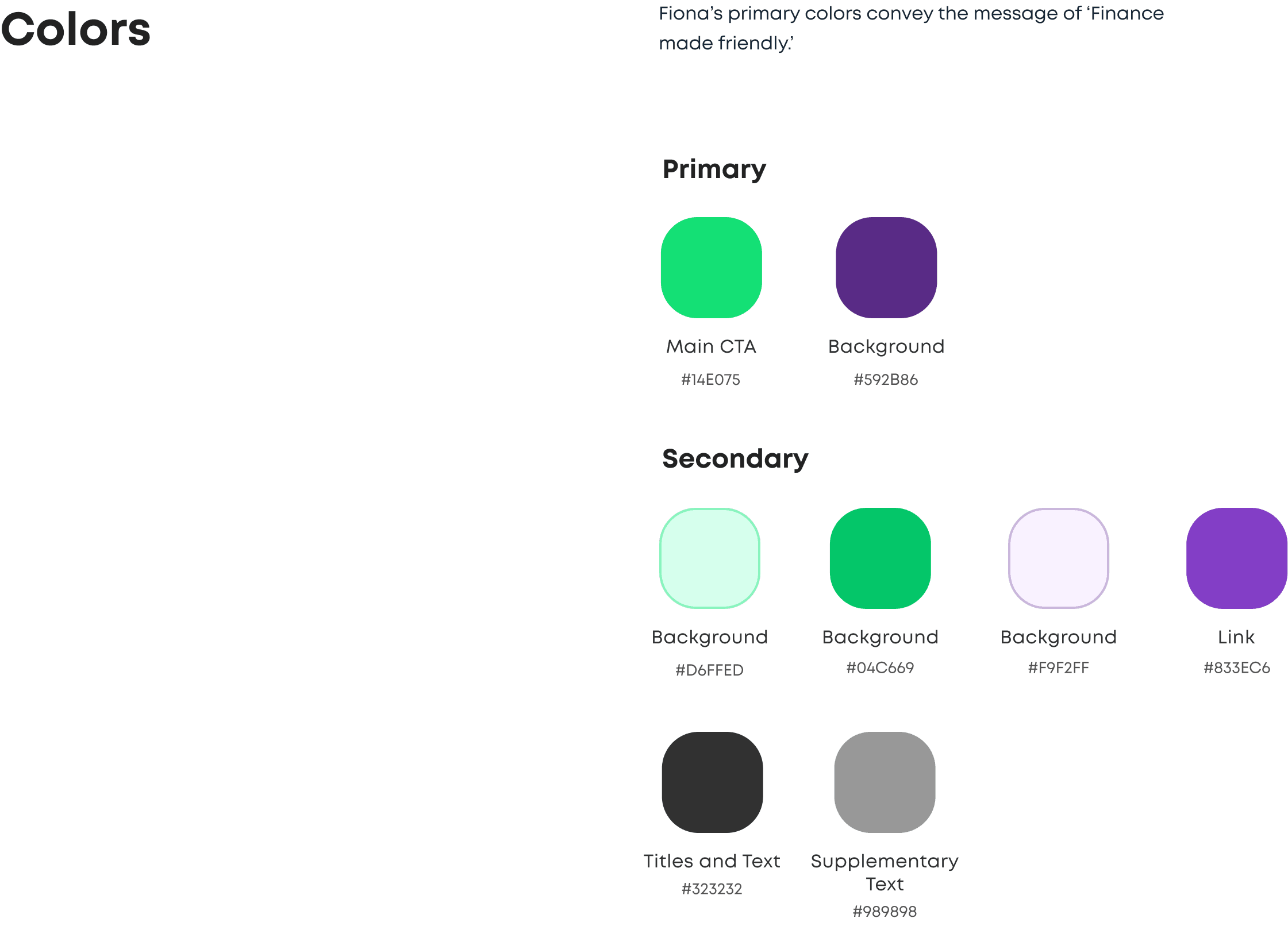
Styleguide
Still more to come
Fiona is still an ongoing project, and even if there is more to come, the experience of accomplishing challenging tasks has taught us a lot. Every department acquired something when it came to working on Fiona. In order to satisfy both compliance and user criteria, Product design must provide distinctive user experiences and user interface patterns. As a result of this experience, Development has learned to write code more effectively and to think outside the box. PM ensured that everything worked well while remaining focused on the same goal. Although Fiona still hasn't reached its final shape, it already is a game-changing platform and a huge hit in the FinTech sector.
Similar projects
Product design
Quality Assurance
Optimize prices to maximize revenue
Corrily tailors your prices and discounts to the needs of different user segments in order to increase your revenue.