


The Good, The Bad and The Neomorphism
Helena K.
2020-05-04
4min
Design
Extremely subtle style and elegant shapes of neomorphism work well as an addition to well structured and designed UI. What are the limitations?

Share this blog:
Neomorphism
In November 2019, Ukraine-based UI/UX designer Alexander Plyuto shared a banking app prototype that featured a new style of mobile interface. He published his design on Dribbble, the digital design portfolio platform, where he described it as his take on evolved skeuomorphic interface. His vision provoked mixed responses and ultimately brought a lot of attention to the unique, never-before-seen style of UI with low-contrast shadows and a monochromatic look. The unusual trend got its name from Polish UI designer Michal Malewicz of HYPE4 studios who described it as “new skeuomorphic” or shorter: neomorphism.

Its creator clearly intended to unite traditional tactility with flat minimalism which has been dominating app design over the last few years. Neomorphic cards and elements visually seem to extrude from the background as a raised shape made entirely from the same material as the background; it doesn't „float“ like other modern material cards and elements.
The limitations in accessibility and aesthetic
From a UX designer's perspective, it's easy to see major issues in the lack of strong enough contrast and difference in colour between the elements. The very first problem arises with background colour – it cannot be fully white or fully black due to shadows being used to achieve the extruding effect. The shadows, light or dark ones, need to be visible on background. This leaves the designer to a limited set of light (or dark) colour palletes to choose from when building the UI.
The bigger issue, however, is the contrast which compromises the entire usability of UI, mainly for the visually impaired and users with low quality screens or low quality screen contrasts. The only thing standing between elements and their respective background are two types of shadows which can easily vanish on lower quality display and basically melt the whole button, card or other element with the background. This would render the whole UI unusable and quite flat, especially in comparison to some other styles like skeuomorphic or material design.

Buttons are off-limits when it comes to neomorphic style – they simply don't stand out at best, and are unrecognizable and confusing at worst, even in Dark Mode of the style. It has a potential to ruin the proper hierarchy of elements in frame.
Aesthetic limitations are also big con of the neomorphic trend; there's a big chance the designer is going to overuse a color if he keeps putting it on all the elements and the background, inserting only a couple of shadows and a border between them. This makes the app monochromatic, dull and flattened into one big chunk of screen, again with no elements hierarchy or any means of highlighting some buttons over the others.
What's it good for
Although this style can hardly stand on its own, it has a good shot at being the next big trend of 2020 if done in combination with other classic styles which take accessibility into consideration.
For example, it can work beautifully on elements such as cards, where the hierarchy of elements within each card is enough for it to work as a functional element inside a frame. Important thing to remember, however, is that card with the entirety of its element needs to function even when neomorphic elements are removed from it. In other words, if it can work without the shadows and highlights surrounding it, all good.
Neomorphism's disadvantages have potential to be used in its favor – its extremely subtle style and elegant, simple shapes work well as an addition to an already well structured and designed user interface. As long as the usual usability guidelines are being followed, it can freshen up an otherwise lacking UI with well structured UX.

What it says about our expectations in 2020
A The controversy and viral sensationalism surrounding the neomorphic trend showcases some important issues in digital design community. Many new designers don't take accessibility and usability in consideration when creating and prototyping, which is alarming considering a beautiful user interface isn't worth much without a good user experience.
Web Content Accessibility Guidelines (WCAG) are often blatantly ignored or pushed aside for the sake of visually attractive and eye-catching designs with very limited, if any, use. This classic example of appearance over functionality isn't at all uncommon on platforms such ad Dribbble or Behance, which are known for their echo chamber effect of popular styles and designers' obsession with popular trends.
For some, the problem lies in lack of rigorous, agreed-upon framework – a style manual of a sort – for UI design which could also draw parallels with common UX guidelines and intertwine them. The WCAG, for example, contains practical recommendations on web and mobile accessibility worth to consider in designing the interface. Similar advice could be put together for user interface design and style trends. This way, newcomers in the industry will be properly warned against some bad practices which have been proven to not work in the many times before.
Share this blog:
A dose of (Design) Dopamine
Updates and resources
In-depth guides
Quality content for free


Similar blogs

Development
Matej Musap
2025-08-18
3min
Beyond the Buzz: How Developers Are Using AI in Real Projects
Development
Matej Musap
2025-07-28
2min
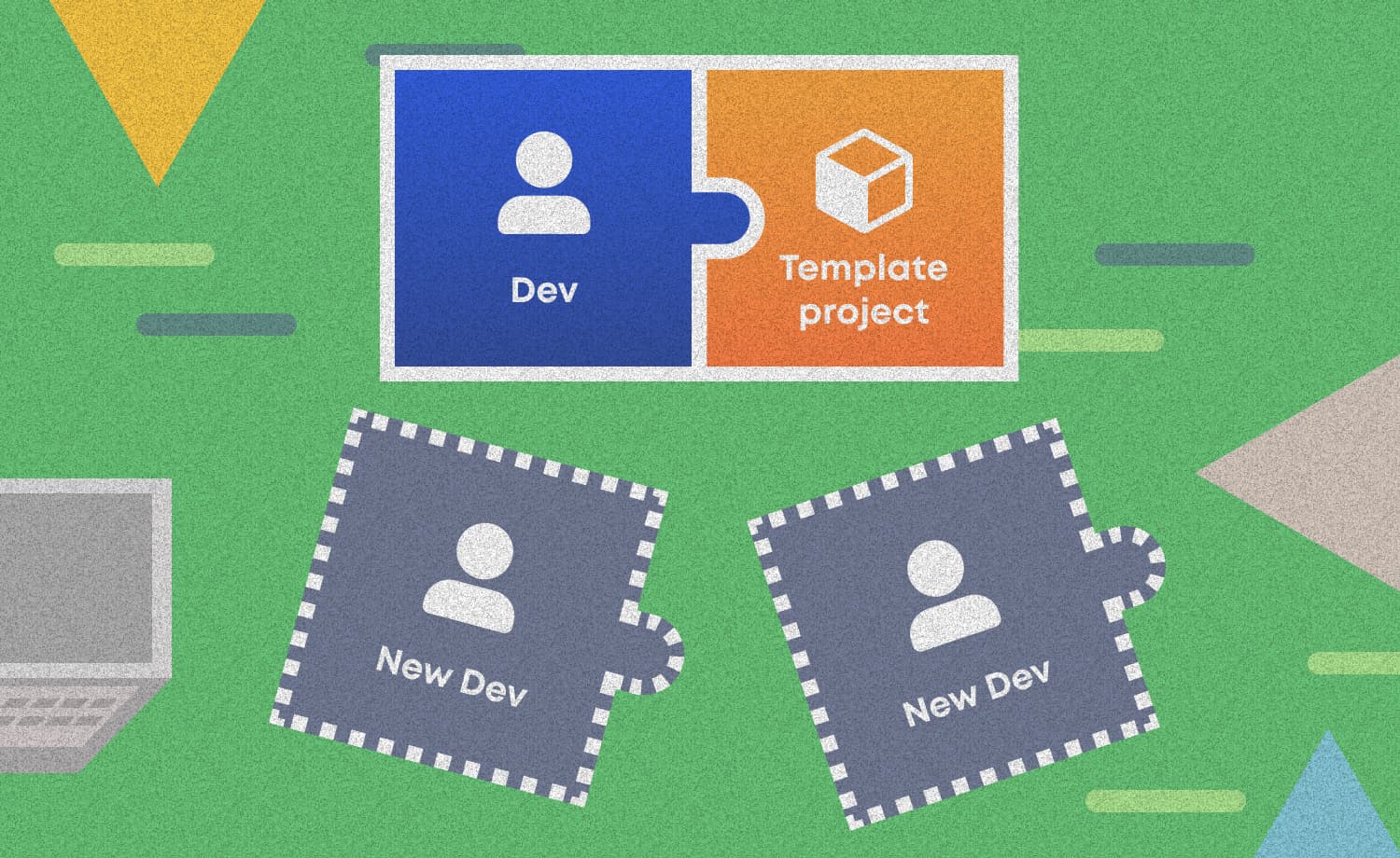
How a Template Project Helps Us Guarantee Code Quality and Team Stability

Sales
Mladen Šimić
2025-06-24
3min